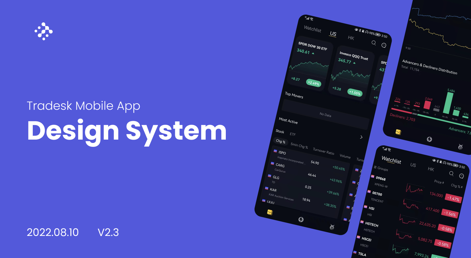
Tradesk: Global Pro Trading App
Tradesk: Global Pro Trading App
2022, Fintech, Mobile App Design, Design System
2022, Mobile App Design, Design System
Build a Design System for an Existing Product
Build a Design System for an Existing Product
Tradesk is an International stock trading platform driven by technology. The self-directed investment platform provides globally diversified portfolio to help users earn the best possible returns.
My collaboration involved crafting a brand identity that effectively conveyed their distinctiveness. This established a visual aesthetic that resonated with their ethos, while simultaneously laying the groundwork for the UI design of their mobile app.
My Contribution
Role: Brand designer → Product designer consultant
Design Team size: Product designers x2, PM x1
Cross Functional Team: Coo, Tech Lead, Development Team
Time on project: 6 month (March 2022 - December 2022)
Areas of ownership: Branding design, Design system, UX audit, Key pages redesign
My Contribution
Role: Brand designer → Product designer consultant
Design Team size: Product designers x2, PM x1
Cross-Functional Team: Coo, Tech Lead, Development Team
Time on project: 6 months (March 2022 - December 2022)
Areas of ownership: Branding design, Design system, Mobile UX UI
The Problem: UI Inconsistency
The Problem: UI Inconsistency
Tradesk growth has outpaced their design cohesion. With a modest team comprising only 1 in-house designer and 1 PM without a design background. PM, Designers, and developers are extracting resources from different places, which leads to inconsistencies throughout the app. Button styles, text sizes, illustrations, icons, and even components lack uniformity, leading to an overall fragmented user experience.
Tradesk growth has outpaced their design cohesion. With a modest team comprising only 1 in-house designer and 1 PM without a design background. PM, Designers, and developers are extracting resources from different places, which leads to inconsistencies throughout the app. Button styles, text sizes, illustrations, icons, and even components lack uniformity, leading to an overall fragmented user experience.
The Solution: A Design System That Brings Order to Chaos
The Solution: A Design System That Brings Order to Chaos
To tackle Tradesk's design inconsistency challenge, I led Tradesk's product team to create a design system. Creating a design system requires the efforts of everyone on the team, from designers to PM to developers to stakeholders to brands. This system brings order to chaos, making sure buttons, text, and icons all match. It guides design in familiar areas and helps explore new ones.
To tackle Tradesk's design inconsistency challenge, I led Tradesk's product team to create a design system. Creating a design system requires the efforts of everyone on the team, from designers to PM to developers to stakeholders to brands. This system brings order to chaos, making sure buttons, text, and icons all match. It guides design in familiar areas and helps explore new ones.
To tackle Tradesk's design inconsistency challenge, I led Tradesk's product team to create a design system. Creating a design system requires the efforts of everyone on the team, from designers to PM to developers to stakeholders to brands. This system brings order to chaos, making sure buttons, text, and icons all match. It guides design in familiar areas and helps explore new ones.
Brand Guidelines as a Foundation
Brand Guidelines as a Foundation
After establishing Tradesk's brand identity, I delivered practical brand guidelines for consistent visual communication. Developed with future design system needs in mind, these guidelines were essential during system development, serve as the foundation for the design system
>See Brand Identity Case Study
Brand Guideline
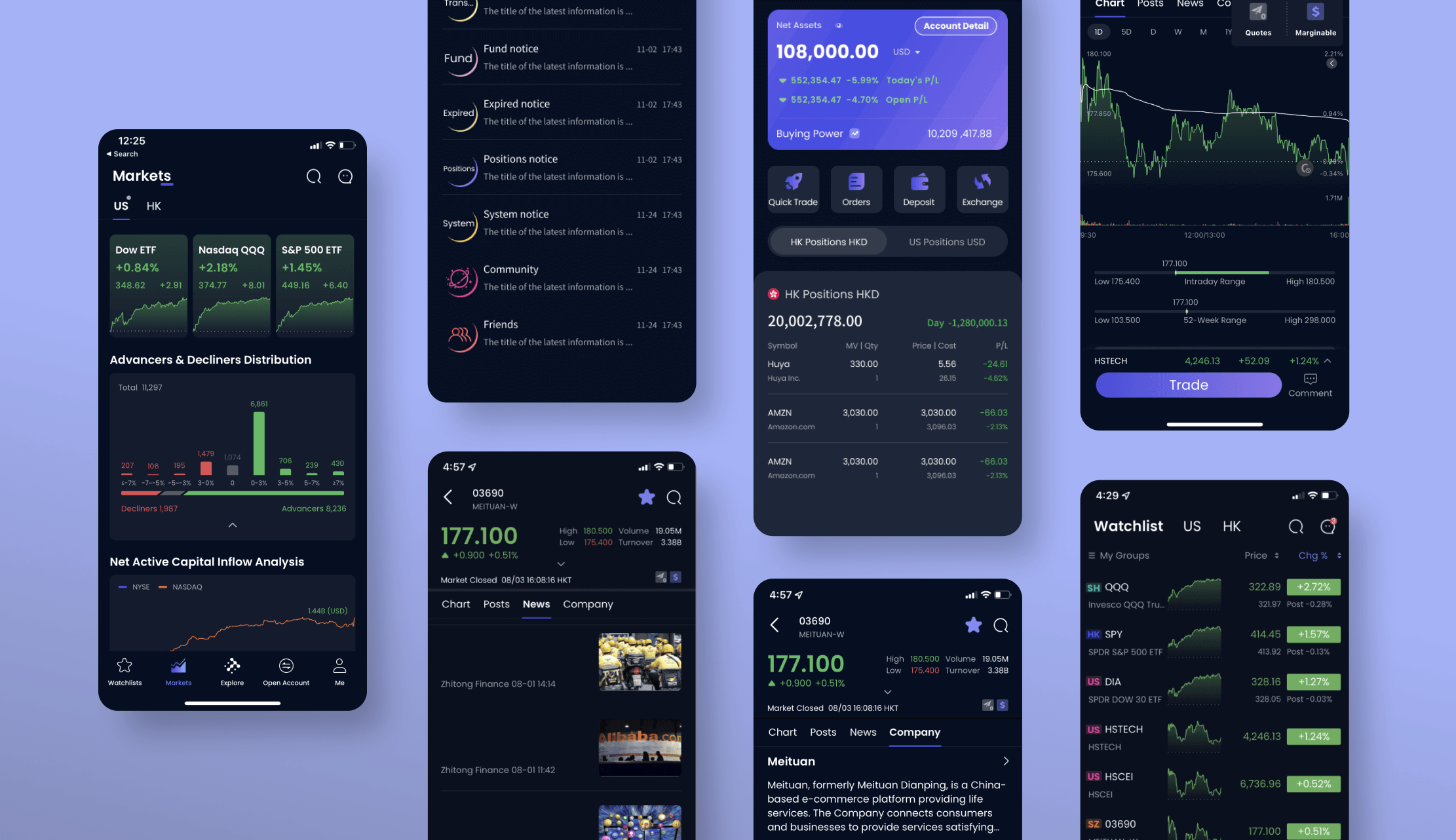
Existing App Pages
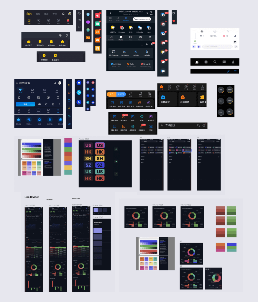
The Step 1: Conducting a Visual Audit
The 1st Step: Conducting a Visual Audit
Starting with a careful analysis of the existing app, we locate all the styles and components of the existing product.
- Listing and Grouping
We identify and compile a thorough list of all UI components used in the app, such as texts, colors, buttons, icons, and navigation bars. - Organizing
We categorize these components into logical groups for easy access and reference, enhancing their usability. - Recording Variations
Each component's diverse styles, states, and variations are meticulously documented, capturing its range of appearances.
By methodically listing, grouping, and documenting these components, we lay the foundation for a strong UI component library. This essential resource will ensure consistency and efficiency across the app's design implementation.
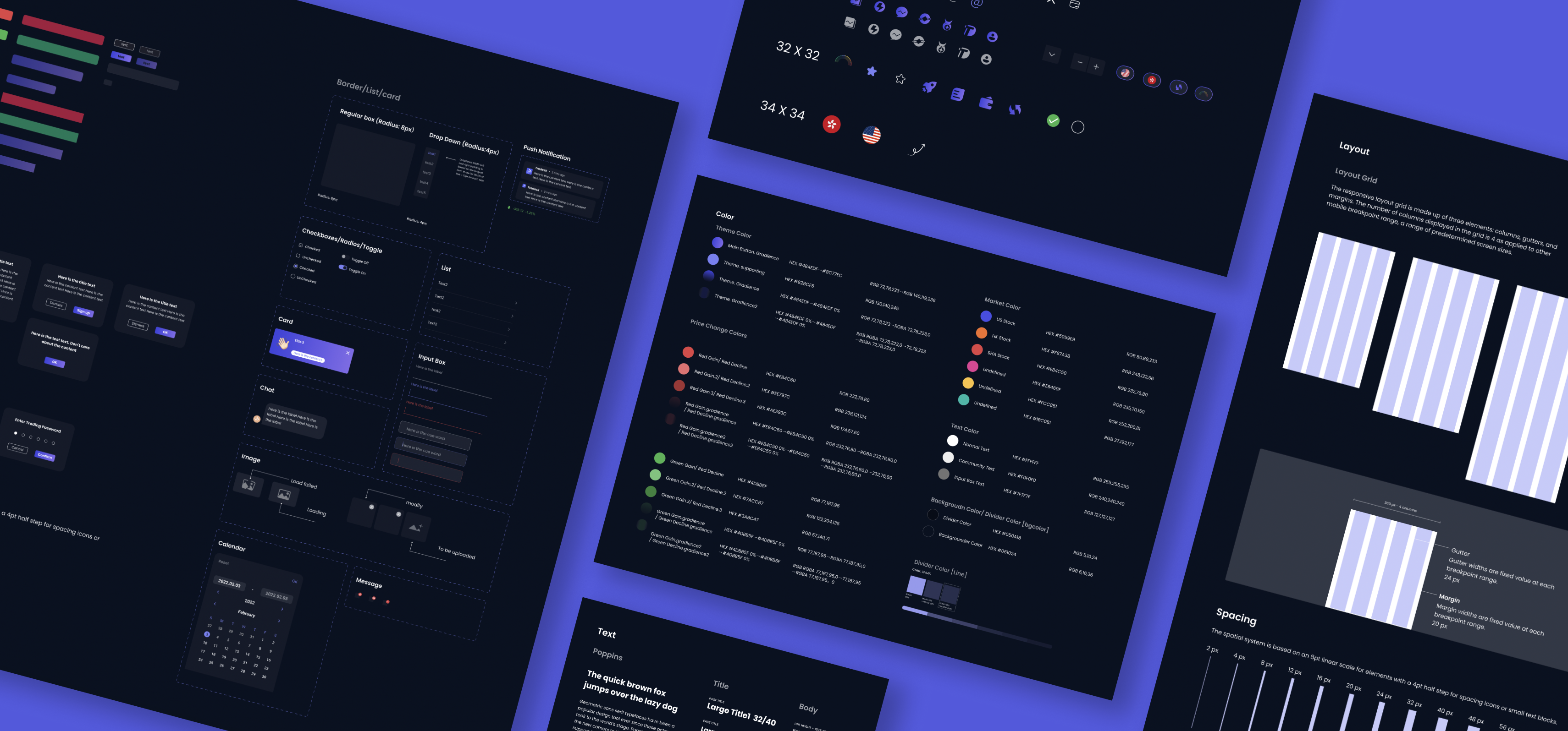
Color Palette
Website Findings and Design Strategy Document
The Step 2: Creation of Styles
The Sep 2: Creation of Styles
Design guidelines are essential to ensure consistent and user-friendly design throughout the application. They serve as a blueprint for maintaining a cohesive and visually pleasing interface. Here are key guidelines in three critical areas:
Typography
Specify font families, sizes, weights, and usage scenarios.
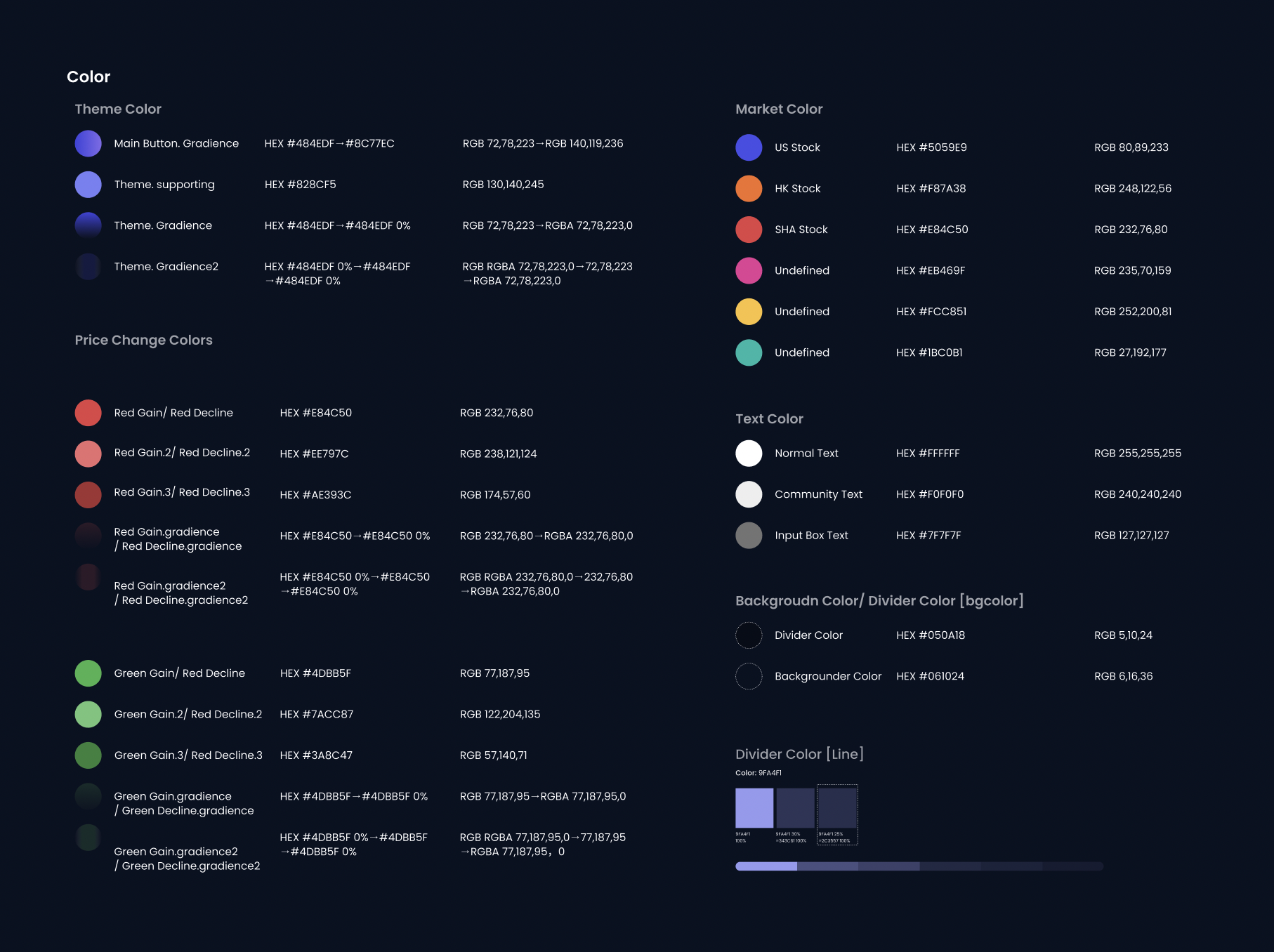
Color Palettes
Define primary color, text color, background color, divider color, price change color, and market color
Layout and Spacing
Set guidelines for margins, padding, and spacing between elements.
Design guidelines are essential to ensure consistent and user-friendly design throughout the application. They serve as a blueprint for maintaining a cohesive and visually pleasing interface. Here are key guidelines in three critical areas:
Typography
Specify font families, sizes, weights, and usage scenarios.
Color Palettes
Define primary color, text color, background color, divider color, price change color, and market color
Layout
Set guidelines for margins, padding, and spacing between elements.
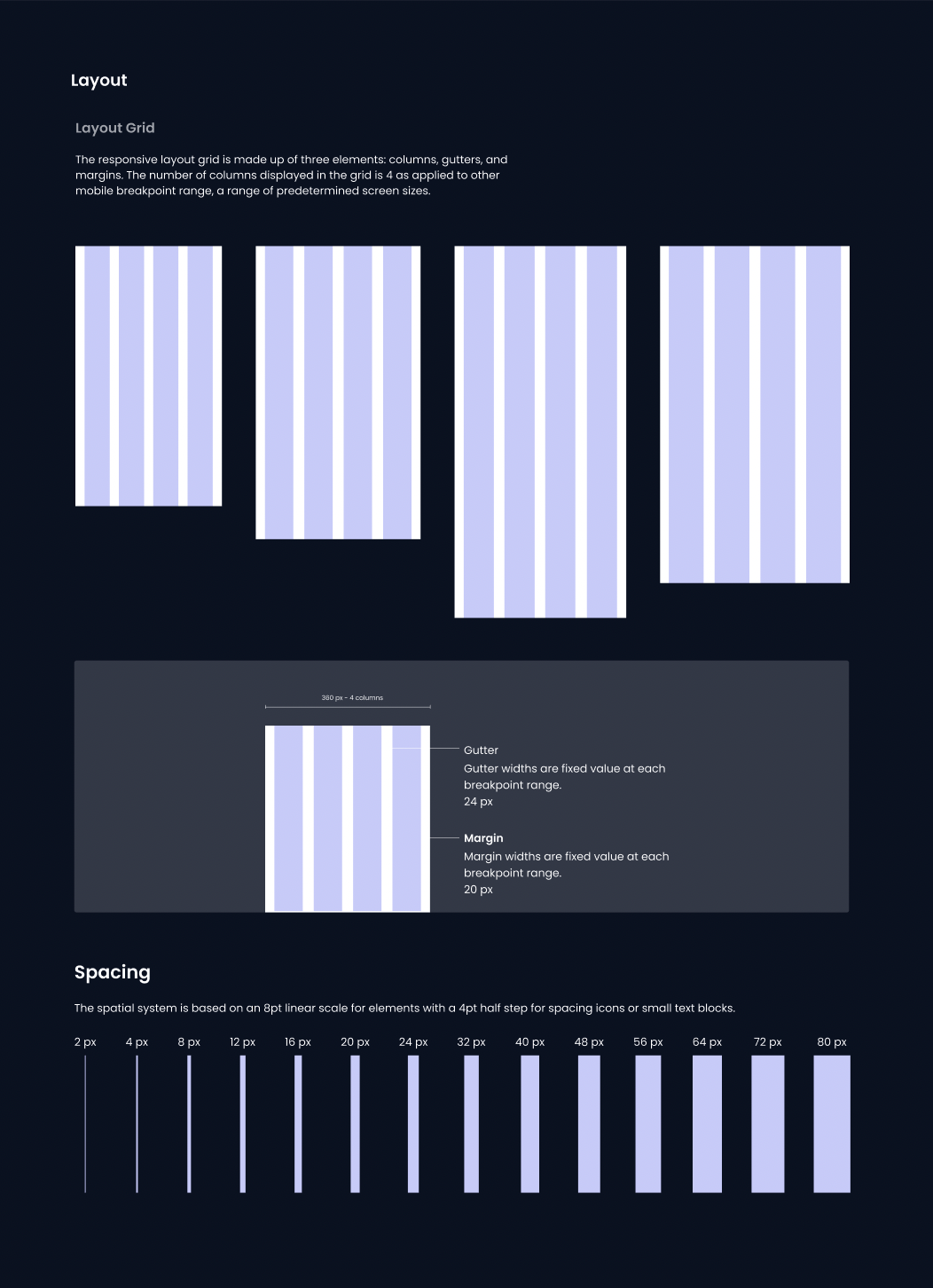
Layout and Spacing
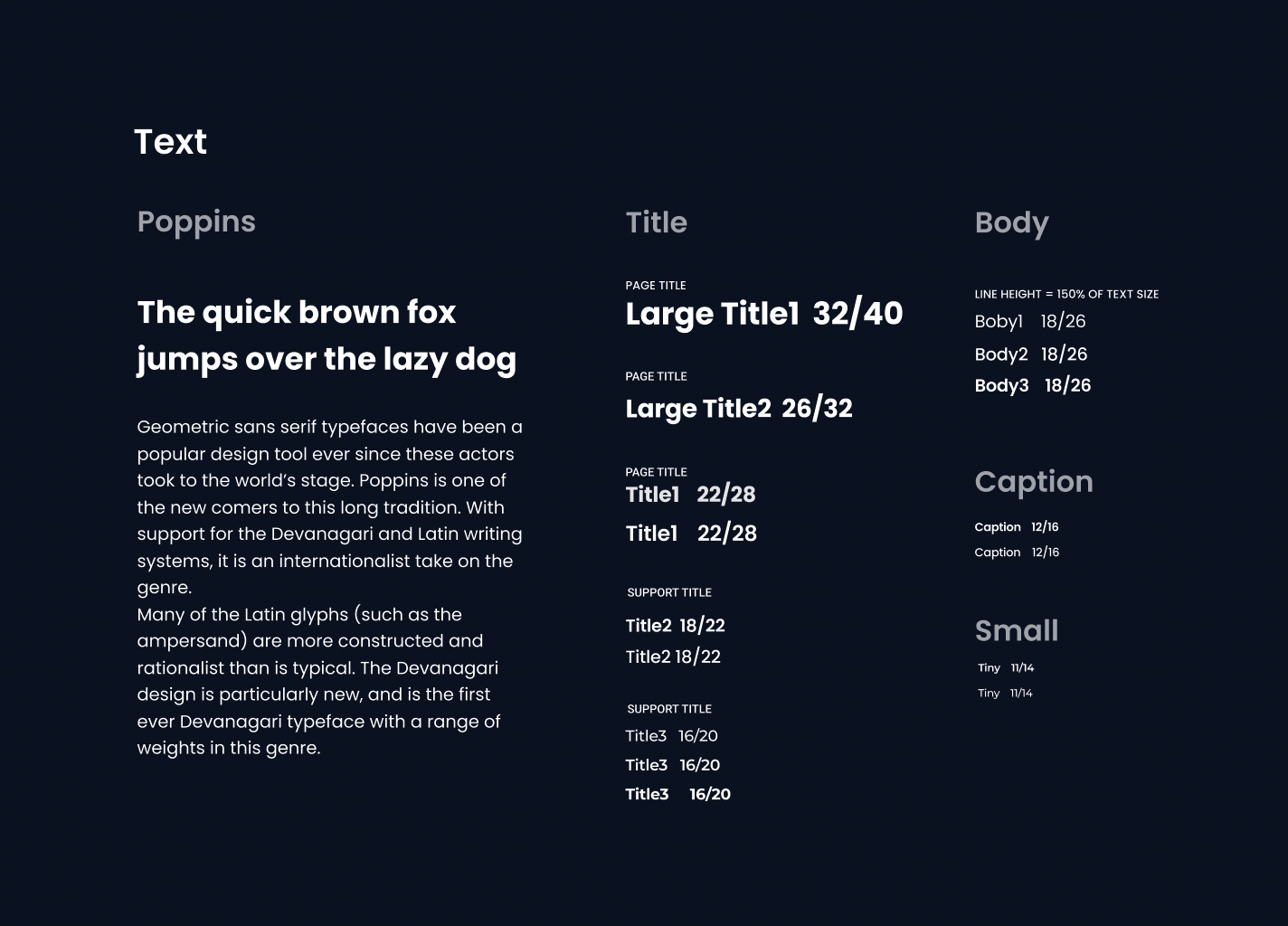
Typography
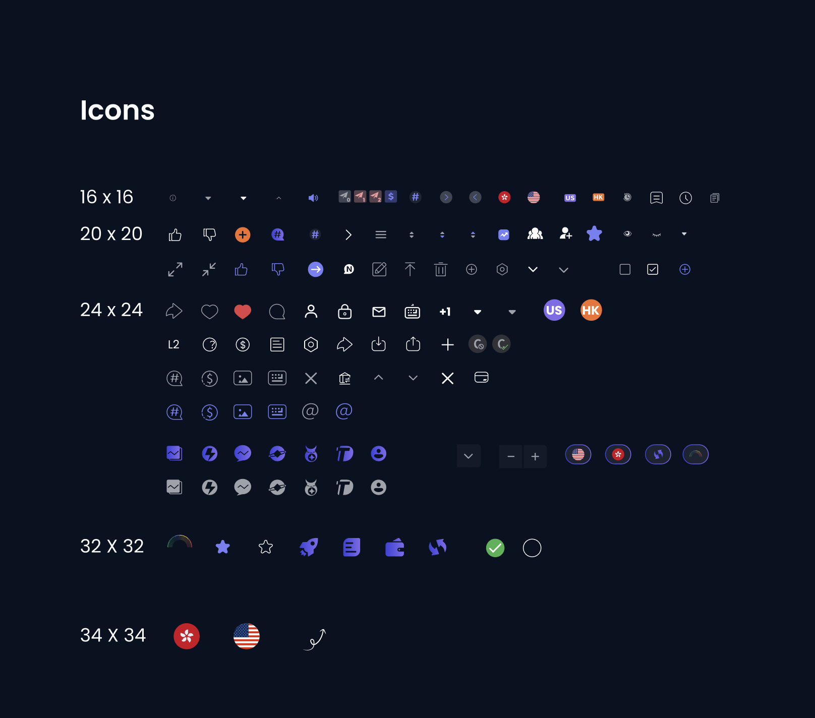
Icons
The Step 3: The Creation of Visual Assets
Step 3: The Creation of Visual Assets
Visual assets play a vital role in maintaining brand consistency and enhancing the overall user experience. The guidelines for visual assets include:
Icons
Develop a diverse library of icons, covering various categories, in multiple formats and sizes.
Logos and Brand Elements
Store different logo versions, symbols, and other brand-related visuals to ensure consistent brand representation.
Icon Design Work in Progress and Drafts
Work In Progress
The Step 4: Creation of Components
The Step 4: Creation of Components
This comprehensive set of design guidelines forms the foundation of the design system, ensuring a consistent and user-friendly interface across various app elements and interactions.
- Pop-up Notification
- Dropdown Menu
- Check Box / Radios / Toggles
- List
- Card
- Input Box
- Chat Box
- Calendar
- Notification
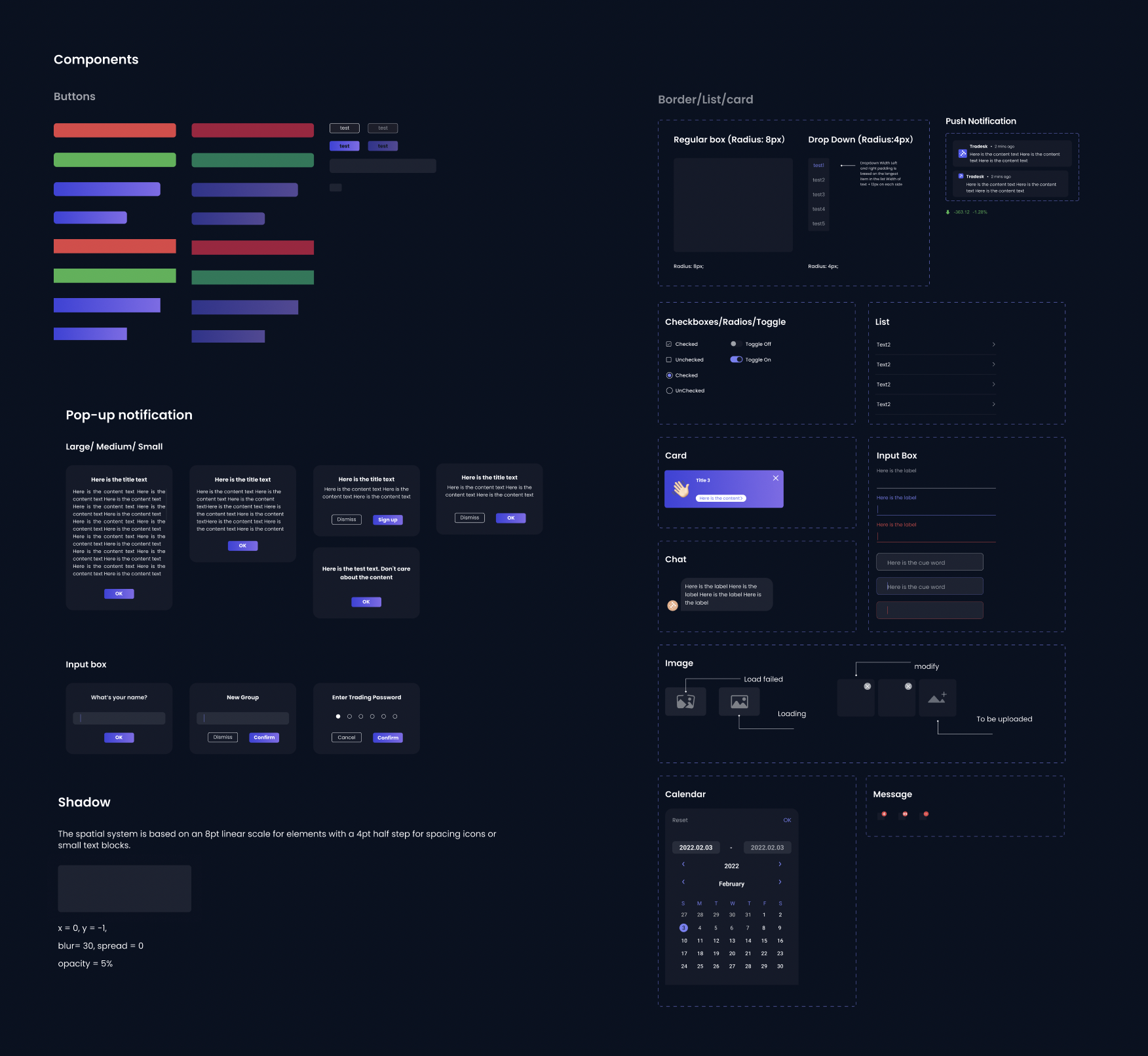
Component Library
The Result:
Implementation of the design systems led to a 32% reduction in bug reports and QA tickets, elevating overall visual consistency across the app.
The Result:
Implementation of the design systems led to a 32% reduction in bug reports and QA tickets, elevating overall visual consistency across the app.
The Result:
Implementation of the design systems led to a 32% reduction in bug reports and QA tickets, elevating overall visual consistency across the app.
Takeaways: Early Implementation of Design Systems for Streamlined Workflow
I found that starting the development of a design system early in the project is crucial. It simplifies the designer’s work, keeps everything looking the same, makes it easier to turn our designs into real products, and, most importantly, saves time for our cross-functional team.
I'm open to freelance projects. If you have an exciting idea, drop me a line.
I'm open to freelance projects. If you have an exciting idea just drop me a line and let's talk about it.
I'm open to freelance projects. If you have an exciting idea just drop me a line and let's talk about it.
I'm open to freelance projects. If you have an exciting idea just drop me a line and let's talk about it.
I'm open to freelance projects. If you have an exciting idea, drop me a line.
© 2023 by Bing n Design All rights reserved.
© 2023 by Bing n Design All rights reserved.
© 2023 by Bing n Design All rights reserved.